
- Introduction
- Inspiration: Georgia O’Keeffe’s Watercolors
- Inspiration: Jim Dine’s Hearts
- Beginning Watercolor Practice
- Useful External Links to Blogs & Videos
Introduction
Drawing inspiration from the fresh and fluid style of Georgia O’Keeffe’s watercolors and the pop-art-like playful energy in Jim Dine’s paintings and prints of colorful hearts in his iconic new-expressionist style — this page is a guide on hands-on learning of watercolor washes, glazes, and resist techniques with colorful crayons and oil pastels for exploration of heightened colors, bold forms, and energetic brushwork, lines, and strokes found in both these artists’ color application.
Inspiration: Georgia O’Keeffe’s Watercolors
Georgia O’Keeffe’s Watercolors from the O’Keeffe Museums’s collection online
An excellent essay with images on O’Keeffe’s watercolors
Georgia O’Keeffe’s use of wet-in-wet and glazing techniques:
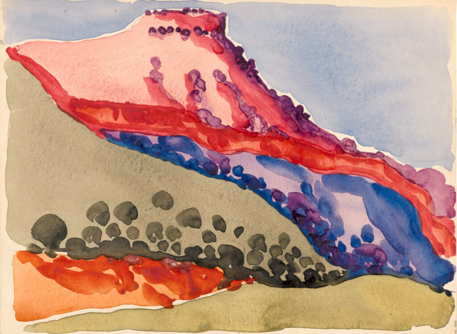

About “Red and Green II” Georgia O’Keeffe, 1916 Watercolor on paper.
https://news.artnet.com/market/georgia-o-keeffe-painting-red-green-in-texas-502649
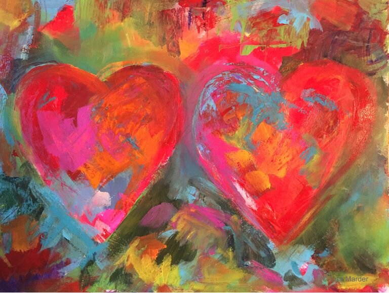
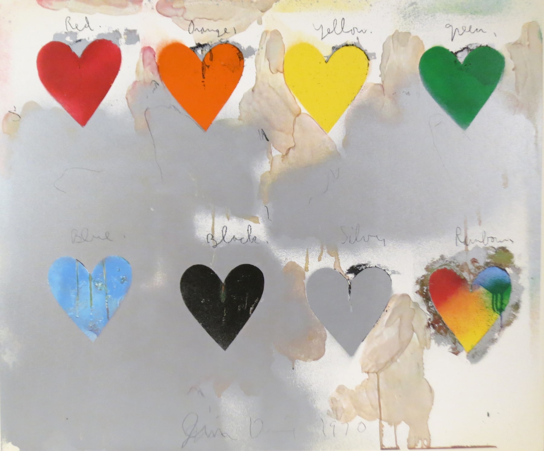
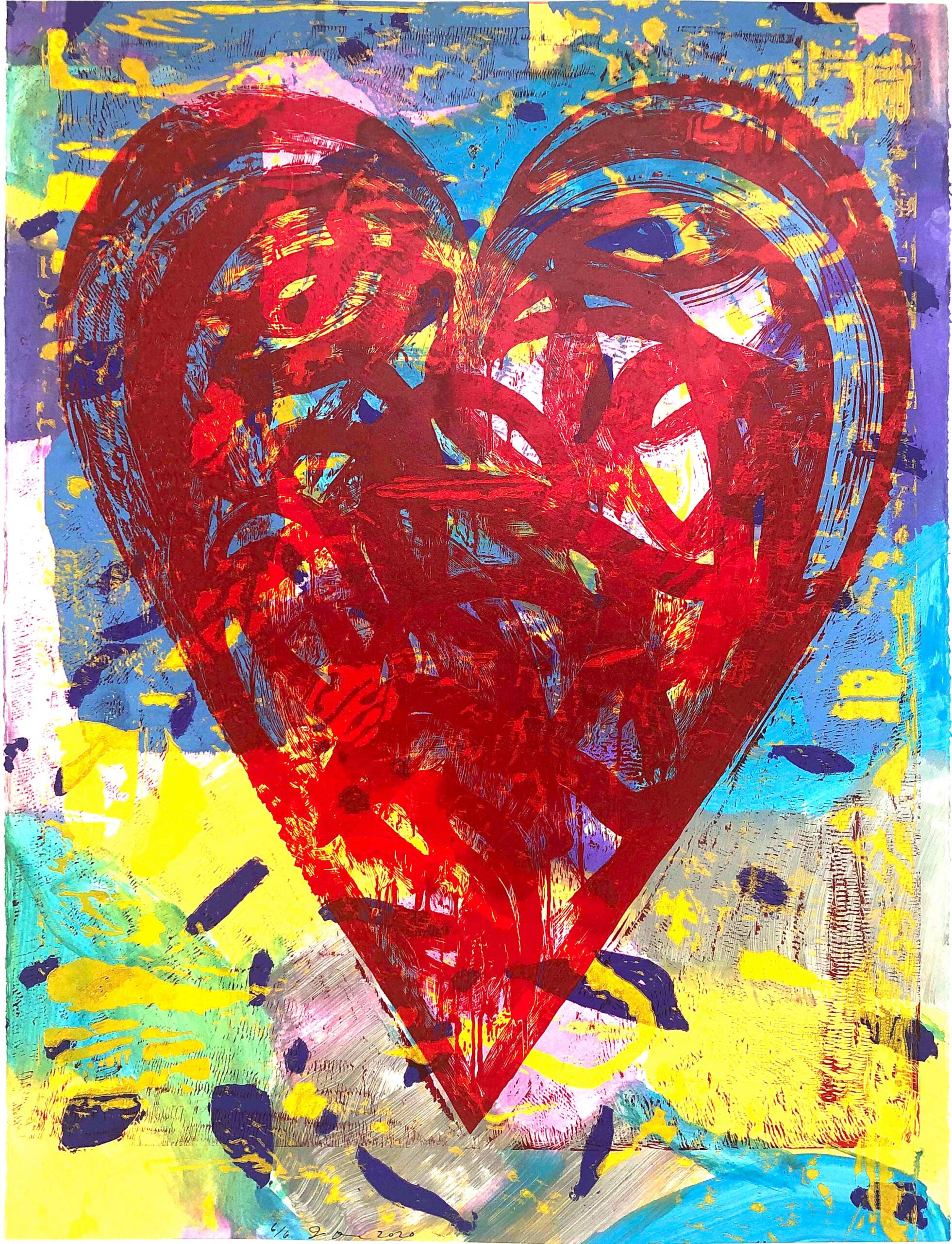
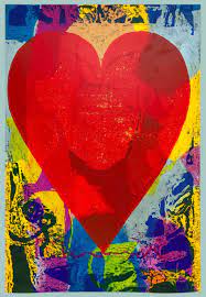
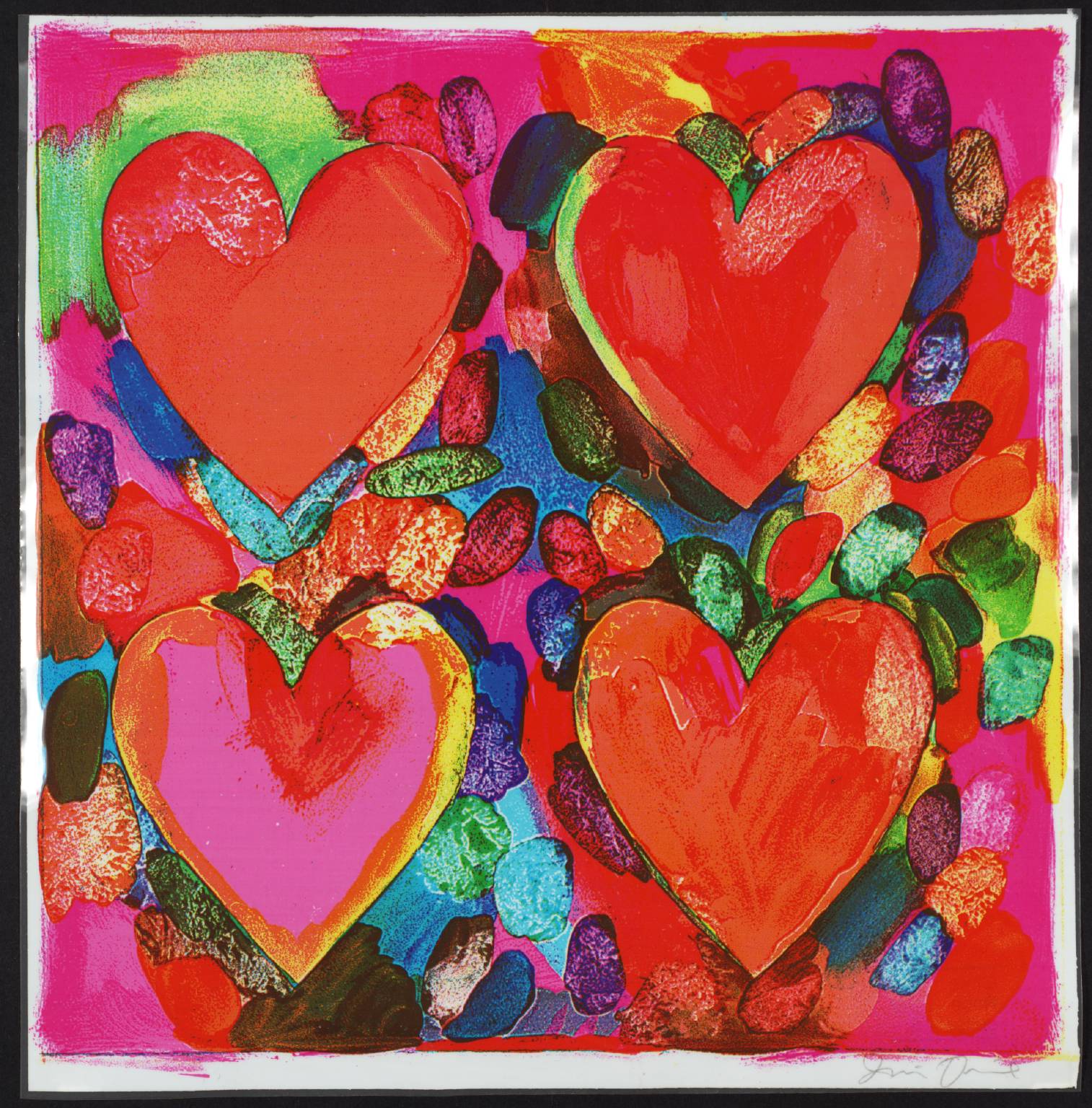
Inspiration: Jim Dine’s Hearts
Like Georgia O’Keeffe, Jim Dine (born June 16, 1935) is an important and well-loved figure in American art — Dine belonging to a more contemporary time period. Dine’s work includes painting, drawing, printmaking (in many forms including lithographs, etchings, intaglio, woodcuts, letterpress, and linocuts), sculpture, and photograph.
“Dine has been associated with many art movements including Neo-Dada (use of collage and found objects), Abstract Expressionism (the gestural nature of his painting), and Pop Art (affixing everyday objects including tools, rope, articles of clothing and even a bathroom sink) to his canvases, yet he has avoided such classifications. At the core of his art, regardless of the medium of the specific work, lies an intense autobiographical reflection, a relentless exploration and criticism of self through a number of personal motifs including: the heart, the bathrobe, tools, antique sculpture, and the character of Pinocchio (among flora, skulls, birds and figurative self-portraits).”
–https://www.tate.org.uk/art/artists/jim-dine-1009
“Jim Dine Hearts is one of the most beloved themes, central to the artist’s historical body of work.
Together with other everyday forms, including bathrobes and tools, Dine’s work is often placed within the realm of Pop Art. While the subjects of his work are taken from popular sources, they do not serve the same ironic sensibility. Instead, they are invested with rich personal significance through the artist’s tactile brushwork, inventive printmaking techniques, and monumental cast sculptures.
A self-described romantic artist, Dine has embraced the heart as a template through which he can explore relationships of color, texture, and composition. Dine’s dynamic repetition of a condensed visual vocabulary has redefined the once-common heart as a personal symbol for the artist.”
– Jonathan Novak Contemporary Art
By his own account, Jim Dine says that he must have created “millions” of images of hearts.
“As a point of origin, the heart represented his wife and their relationship, but the universality of this form allowed him to use it as a base for visual experimentation. Over the course of several decades, the heart has become the basis for variations in color, materials, composition, and technique. The result is an extended series of formally-inspired works centered around an iconic shape that the viewer can read as both intimate and generic. Dine has also repeated these experiments across a variety of media including drawing, prints, paintings, and sculptures.
By singling out one shape and returning to it repeatedly, Dine suggests to the viewer that it has significance to be discovered. Through his close focus on the simple form of the heart, and his repeated and prolonged attention to this iconic shape, Dine transforms a trite, almost meaningless subject into something that demands our attention and our consideration. Confronted with a series of hearts, the viewer begins to believe there must be some value to this subject, even though Dine has claimed his interest is largely visual.”
–https://www.theartstory.org/artist/dine-jim/
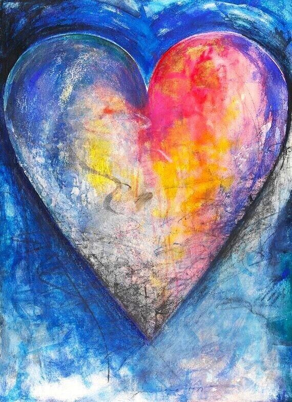
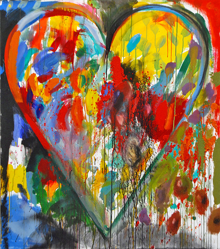
Pinterest Board (collection of Jim Dine Hearts and Jim-Dine-Inspired Hearts)


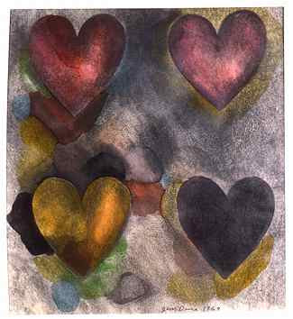


Above: Jim Dine. Two Figures Linked by Pre-Verbal Feelings, 1976, etching, aquatint, and chine-collé with hand painting. 27 5/8″ x 22 3/4″
Beginning Watercolor Practice
Painting Watercolor Washes & Gradients
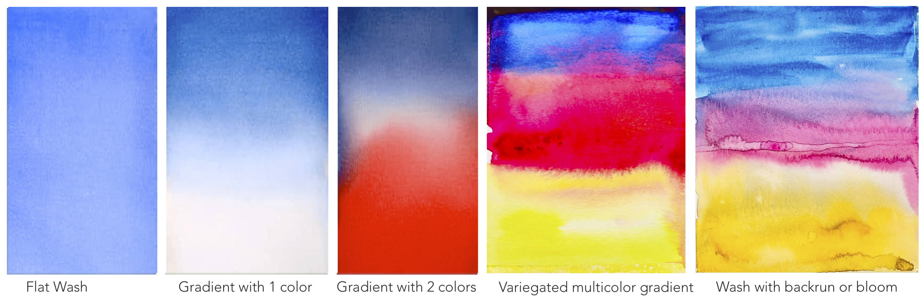
With a focused practice of creating several possible ways of creating watercolor gradients first, we can be better prepared to explore various possibilities before painting a full-fledged composition with skies and clouds.
Skies and cloudscapes have been popular with watercolorists, as the medium lends itself beautifully for not only creating gradients, but also for soft textures and wispy, feathered edges that are ideal for depicting clouds. This Pinterest board shows a compilation of a wide variety of styles and techniques used by artists, especially watercolorists to interpret the beauty of skies and clouds.
- Flat wash with one color – useful for skies and any area requiring smooth color with no visible brush strokes.
- Gradient with one-color — ideal for skies
- Gradient or graded or graduated wash with two colors – great for skies, soft transitions of light to dark or vice versa, used often in Far-Eastern Asian watercolor and woodcut prints.
- Variegated multicolor gradient wash – used when you need a transition of one color to another, like when painting a sunset where the color in the sky transitions from blue to orange. It’s important to not let the color get mixed too much so you don’t end up with a muddy brown-green in between.
- Back-run or bloom: Apply water or another wet color by dropping it into a semi-damp surface and allowing new colors to merge and stop or mingle based on the amount of dampness of the previous wash.
Useful External Links to Blogs & Videos
Tips & Tutorials: beginning watercolor
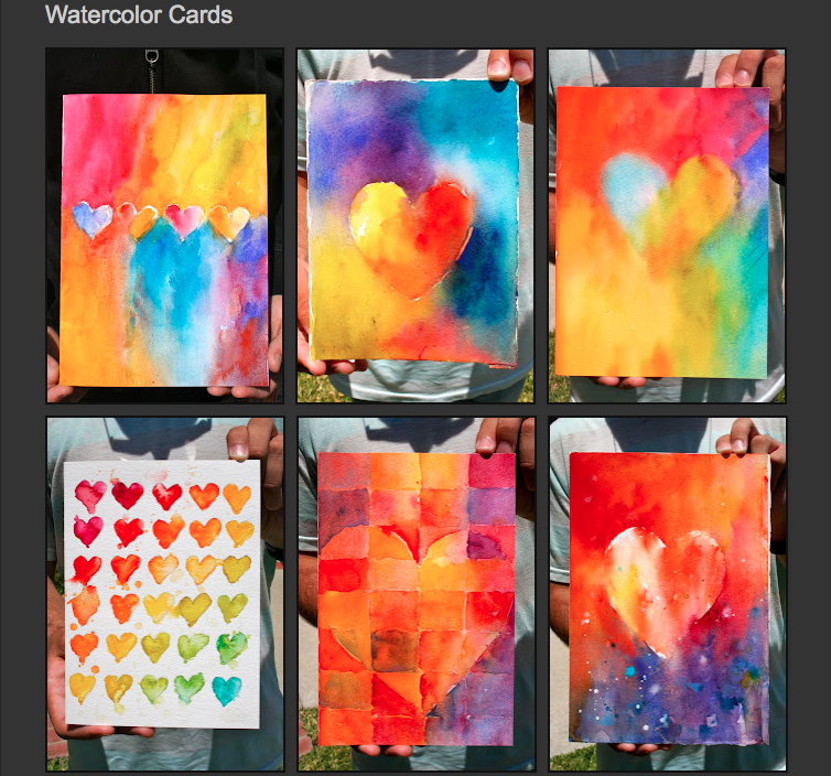
Watercolor Hearts
From: https://josephstoddard.blogspot.com/2011/07/watercolor-cards.html
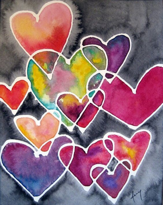
Below: Artist unknown.


Below: from BestdealFriday. Artist’s name wasn’t found.
Have Fun!
Contact information: SudeshnasArt@gmail.com
Instagram: https://www.instagram.com/santafe_online_art_studio

