
Color Study set up from Nov 4, 2023:

Inspiration:
“Georgia O’Keeffe collected organic souvenirs, from stones and shells to feathers and bones. While at Lake George, she also delighted in gathering leaves that appealed to her for the striking diversity of their shape and coloring. She created twenty-nine leaf pictures between 1922 and 1931, all based on the leaves she collected at Lake George. The leaves reflect the crux of O’Keeffe’s art: the fusion of objectivity and abstraction as a means of expressing her inner emotions. In these works, O’Keeffe transforms the lines and colors of the objective form – a leaf – into an abstract composition.” – https://www.georgiaokeeffe.net/autumn-leaves.jsp
Compilation of Gerogia O’Keeffe’s paintings of autumn leaves on a Pinterest Board.
A collage of paintings featuring autumn leaves by Georgia O’Keeffe:
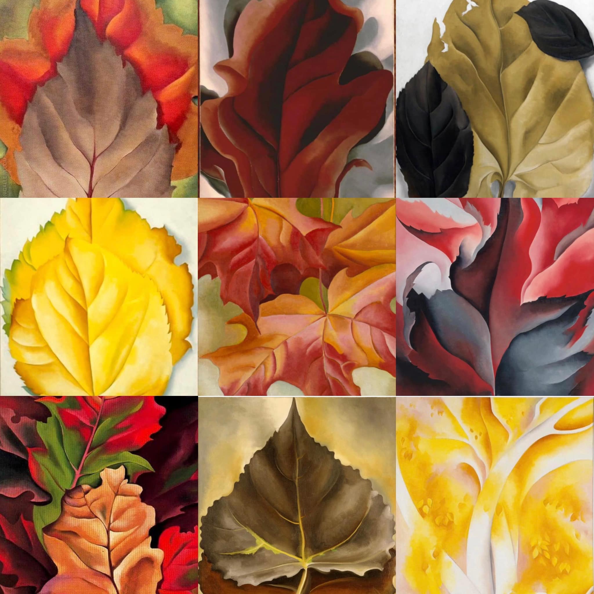
Compiled by Cheryl Palmer Karo for non-commercial purpose, with images from multiple sources on the internet.
Watercolor Tools & Supplies
For in-depth information on how to get started and organized with the right materials, visit this page that also includes links with more information on colors.
Recommended Supplies

List of supplies available at merriartist.com in Oregon, USA. The same or similar items should be available from other online sources in the US and most places in Europe as well:
- Jones Travel Palette: 12 well + mixing areas with lid
- Fluid 140lbs Cold Press acid-free Watercolor block 12” x 16″. It has two glued sides and requires the other two sides to be taped down in order to stay fully flat during painting and until the completed painting is fully dry before removal from the block.
- Strathmore 500 series (100 % cotton & acid free) 140 lbs Cold Press Ready-Cut Sheets 11” x 14” six pack
- Royal Soft-Grip Watercolor Round brushes in size 6, 8, 10, 12, 14 and Watercolor Flat 1” or Simply Simmons Watercolor Round brush no 6, 8, 10, 12 and Watercolor Flat 1”
- Watercolor tubes in these or similar colors:
- M. Graham Hansa Yellow,
- Holbein or Daniel Smith Quinacridone Gold
- Van Gogh Vermillion or Pyrrole Orange or Permanent Orange,
- Van Gogh Carmine,
- Van Gogh Rose orQuinacridone Rose, or Holbein Opera or Daniel Smith Opera Pink,
- Van Gogh Quinacridone Purple Blue,
- Van Gogh Ultramarine Blue,
- Daniel Smith Manganese Blue Hue,
- Van Gogh Viridian,
- Van Gogh Sap Green,
- Holbein Leaf Green (15 ml) or Van Gogh Permanent Yellowish Green
- Daniel Smith Burnt Sienna.
- Optional but recommended paints to add to your set as extra colors: Daniel Smith Cerulean Blue, Van Gogh Indian Yellow, Grumbacher Academy Thio Violet
- Optional: For adding details with watercolor pencils –Faber-Castell Goldfaber Aqua Pencil 12 color set in metal tin.

Reference Images
Reference photo of the set-up for observational color study in a live class on December 13, 2024:

For Color Study of Leaves class on Nov. 2, 2024:

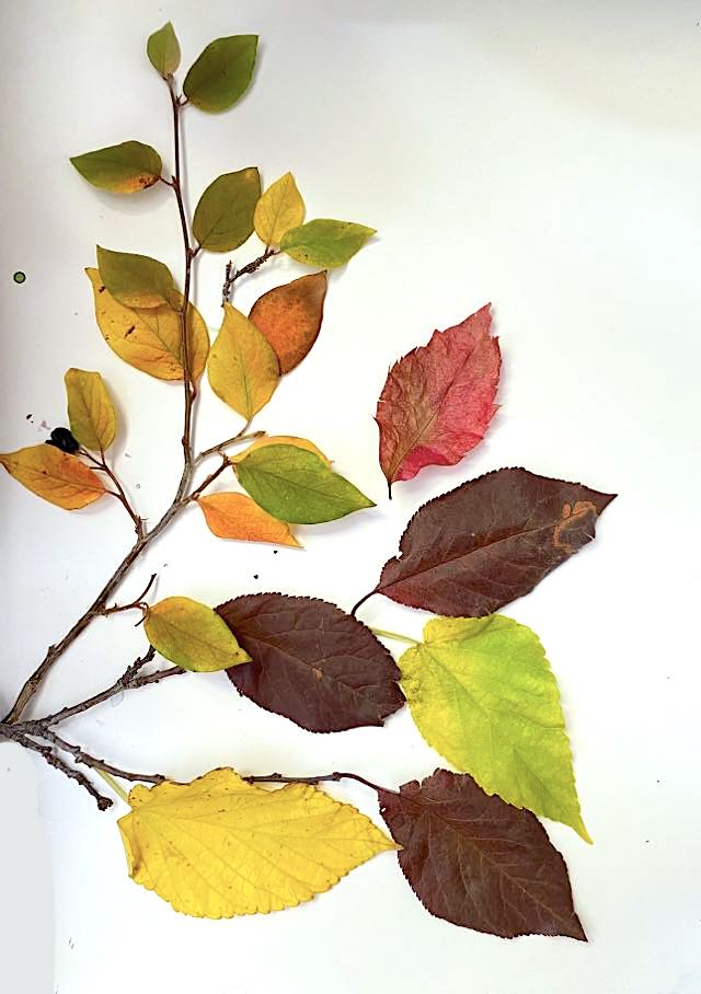
Leaves set-up for observational color study in a live class on Oct 12, 2024:

Leaves set-up for observational color study in a live class on Dec 2, 2023:

Alternative to use as a print-out:
For further understanding of color for watercolorists, please feel free to visit a dedicated page on color mixing.
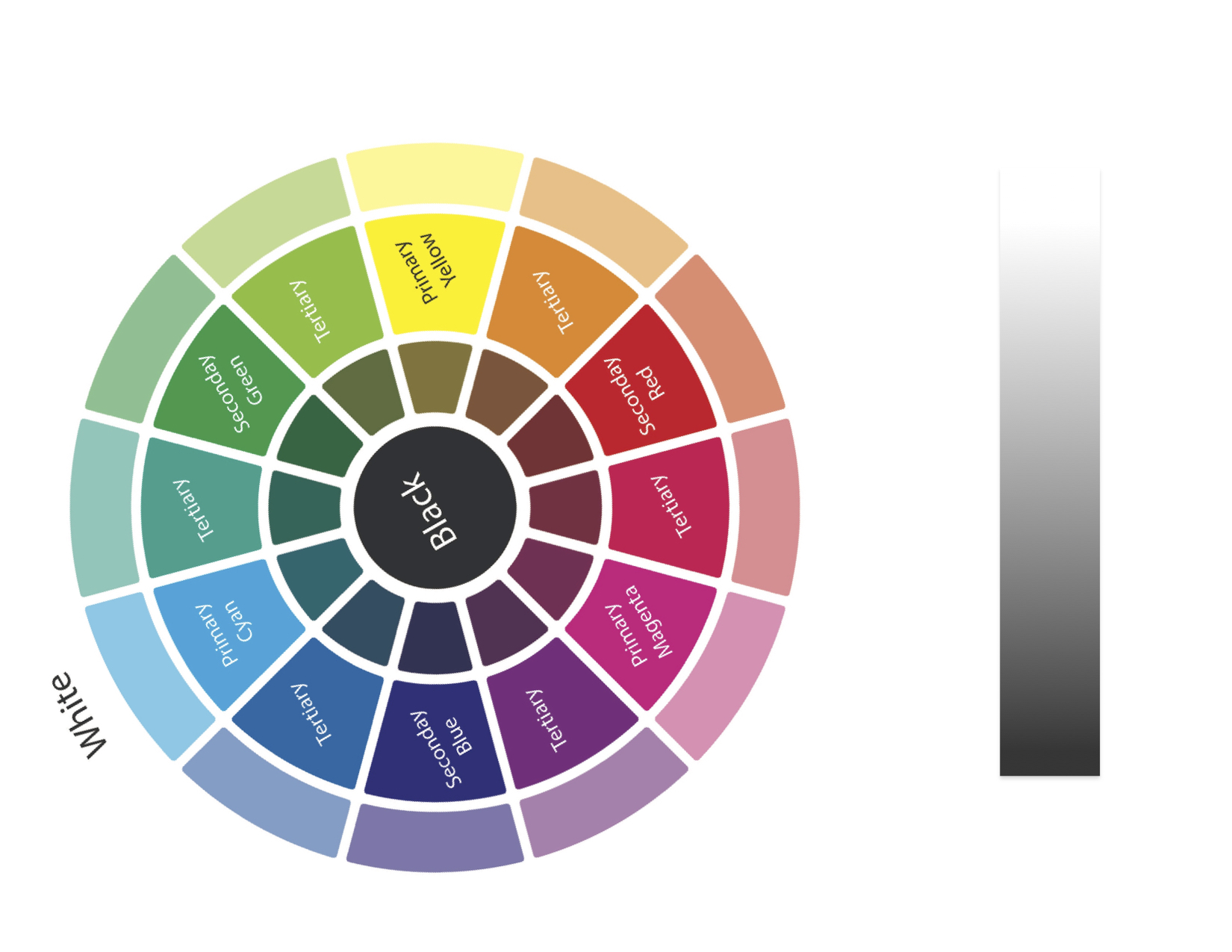
The CMY (Cyan, Magenta, Yellow) Color Wheel
Provided below, additional information to understand the latest color wheel further that contains Cyan, Magenta, Yellow as the three primaries. Technically, all other colors can be mixed with just those three paints, as shown in the digital as well as the hand painted versions below. However in real life, it is convenient to have the tubes of readymade paints. Also, certain pigments such as Ultramarine Blue (pigment number PB 29) offer certain textural and other characteristics (granulating, lifting, staining, etc.) preferred by watercolorists that cannot be created by just mixing the three primaries.

Color Mood-Boards & Color Harmonies
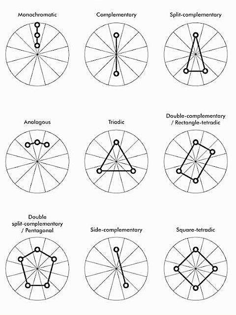
Once you are done documenting the color mixes as color swatches from your nature-color-study, it is often worthwhile to study the color relationships within a particular combination of colors to understand what makes those colors work together harmoniously as a set, especially in nature. That knowledge then helps artists and designers to create their projects based on those color harmonies.
Some of the most common color schemes or color harmonies
This website features an interactive and instantaneous Color Harmony FinderLinks to an external site.
Analogous — includes colors that are next to each other on the color wheel, creating clear and smooth color schemes.
Analogous – Accented — similar to the Analogous rule, but includes a complementary (contrasting) color in addition to the adjacent colors.
Complementary (also known as “contrast”) — balances the base color with the opposite color on the color wheel. Warm and cold colors are created for vibrant and energetic color schemes.
Monochromatic — includes variations of a single color, creating soothing color schemes.
Tetrad — based on a pair of colors and their complements on the color wheel. This rule usually creates bold color harmonies and requires careful planning when used.
Triad — balances the base color with colors that are situated close to the opposite end of the color wheel, forming a triangle. This harmony rule usually creates color schemes of soft contrast.

This video shows how to create a color mood-board in watercolor showing color-harmony within the color palette (set of colors in a particular combination or group):

To get in touch with Sudeshna Sengupta, you may email: SudeshnasArt@gmail.com


I had signed up for the class today but I missed most of it because I was having technical difficulties. Was it recorded?
LikeLike
The O’Keeffe Museum policy is not to record their classes–they are offered as live experiences. This online class as well as in-person classes on same or similar topics are being offered again this fall in October and November. Please check out okeeffemuseum.org/events
Hope you can join us.
LikeLike